How to make your e-commerce website copy human
People buy from people.
As small business owners, no one knows it better than us.
For product brands, bringing the human (you) to your website can be tricky.
Even the word “ecommerce” feels clinical, void of humans with our complicated brains, emotions and lives. That’s exactly why humanising your website is vital. Humans are messy and you need website copy that understands that.
As an ecomm owner, you’re selling a thing to a buyer from behind a digital shopfront. The focus is on your product, not you.
Rightly so.
In the era of AI, humanising your brand is more important than your daily coffee fix. We crave emotional connection. That’s something AI can’t bring.
As humans, we want to connect with other humans. We want to know who our dollars are supporting. Why the business owner is in the game. How they make/procure their products. Where their fire comes from. Who is behind the brand.
All of that is immensely engaging for your buyers who want to know, like and trust you – and your brand.
But you don’t have to sell your soul or become the face of your brand to do it.
Here’s how to make your eccom website real and human
1. Use first person
Emotional connection 101. Write from you to your buyer. i.e I/me/we/us to YOU. It’s an easy way to build trust, loyalty and emotional resonance. Instantly more connecting than referring to you brand in the third person or saying “our customers.”
If you’re a solo operator don’t be afraid to use “I”. Let your buyers know they are buying from a real person to build confidence and ( you guessed it) connection.
2. Tone of Voice
Use an intimate, chat-over-a cuppa tone of voice. That doesn’t have to mean casual, slang or sweary – it just has to feel like your brand. Write in a relatable way that shows you understand your audience in your brand voice.
Use:
- Analogies e.g “Like a pen needs a page”, “I’m the gin to your tonic”, “we go together like guac and corn chips”
- Simple words rather than complicated ones e.g “utilise” vs “use”, “additionally” vs “plus”
- Contractions – “we’re” not “we are”
- A mix of short and long sentences
- Write in first person active voice. e.g Active: We’re all about giving kids the independence they crave in the kitchen vs Passive: The independence craved by kids in the kitchen is what we’re all about.
- Kill weak words when writing about product benefits e.g “might”, “could” “just”. “We could be your secret weapon” vs “We are your secret weapon”
3. Slide in an About you snapshot on your Home Page
Who doesn’t love a story that gives a sneak peek into your brand? Your Home page is where most of your audience enters your site. It’s the perfect real estate to remind them that you’re a small business, an actual person and to create engagement, buy-in and understanding of the who behind the brand.
Plus, it’s great for directing buyer behaviour, internal linking and overall user experience. A short para with a call to action linking to your About page is all you need. Bonus points for an image of you. 🙌
4. Hi, buy product descriptions
The best product descriptions have zero ick. You know the kind… you read it and cringe. Sales cheese is layered with inauthenticity and a drizzle of AI.
No one likes being sold to. But we do like facts, features, benefits and finding the right product when you Google it. (Hello, SEO).
Take-my-money-now product descriptions show your customers…
You fully understand them.
How you transform their life.
Why there’s no better solution.
To write hi, buy product descriptions, consider these elements:
- Structure – make it consistent across all products.
- Rule of thumb – have a one or two liner summing up the product and why it’s amazing. Body boy copy nutting out all the things your buyers want to know. Wrap it up with a bullet point list of features linked with benefits.
- Trust icons – graphics that highlight benefits/tackle barriers in a glance. Think award logos, Afterpay, flat rate shipping, made in Australia etc.
5. User experience – keep it human
Websites are for humans to read, use and buy from. That’s why your humans (ideal buyers) should be front of mind when designing your site. Known as UX, user experience is a design element worth wrapping your mind around.
Anything that improves or simplifies human experience on your site will amplify brand loyalty, engagement and conversions. Think…
- Compare product feature – reduce overwhelm and decision paralysis. A no brainer especially if you have similar products.
- Size guide – include model’s name, size and measurements to make it easy to find the right size, relate and see how garments fit on different shapes.
- Live chat for customer support – no, not a VA or bot pretending to be a human. Rounded does this really well and you can chat in real time with a real person.

- Live order tracking – your buyer wants their item ASAP. Make it easy for them to get their hands on it and plan when and how they’ll use it for the first time
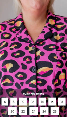
- Quick add to bag on scrollover – fewer clicks to add to cart? Yes please. Proud Poppy does this beautifully.
6. Social Proof
Make or break. Where add to cart meets pay now buttons, trust pops its head up. And stirs doubt in your buyer’s brain. Trust in the brand, in the product, in the returns process, after service and in brand longevity. Stamp out those doubts like a teen on an arcade dance machine with the power of social proof.
Social proof shows how others have behaved in the same situation. You could use it with…
- Scarcity – when stock is low, have a countdown showing how many products remain (for the love of all things ethical, please only do this when stock IS actually low)
- Reviews – trusted and true, buyer reviews are magic for ecomm, especially when used on the respective product page. Use suburb/state, product and image where possible to amp up credibility and relatability.
- Transformations – before and afters are gold for showing the change your product brings
- Facts & figures e.g. trusted by thousands of Aussie mums, as seen on Lisa Corduff, triple roasted etc
Infusing the human (you) into your ecomm brand on your website can be simple. You don’t have to be the face or voice of your business. Whichever of these ways 👆 you choose, follow your gut and bring the human in a way that feels right for you.


